Polaroid demo


Credit to Una Kravets for inspiration on the polaroid effects. Check out her CSS lomography post for more!
Description
This Polaroid component is a quick abstraction around an
img
tag. It renders a lightly processed version of an image, using CSS
filters
to make the image look more vintage.
The Polaroid component also takes an optional effect prop, rendering more complex effects via CSS gradient overlays.
Component example
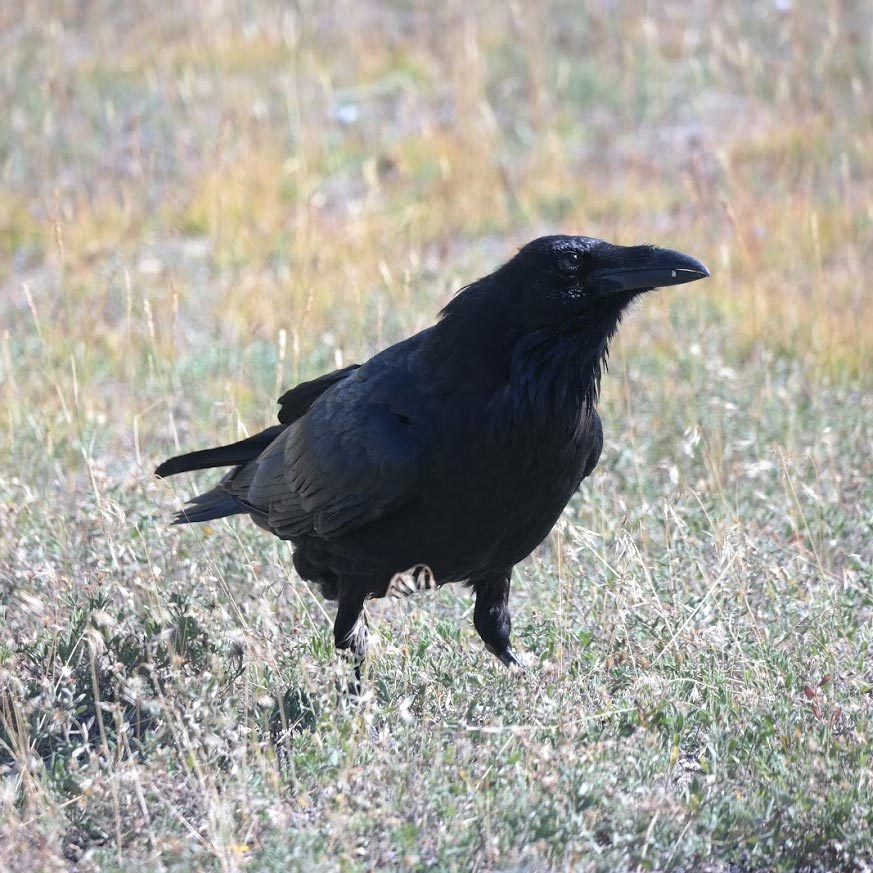
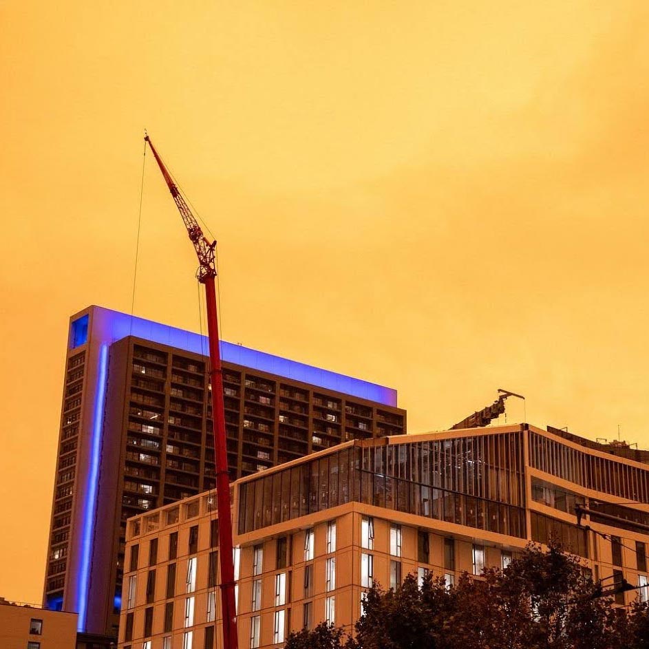
<Polaroid src="https://res.cloudinary.com/chrsjxn/image/fetch/q_auto,f_auto/https://www.chrsjxn.io/images/profile.jpg" alt="Developer self portrait" effect="drama">
	SF 11/01/2020
</Polaroid>
How it works
CSS effects
CSS effects in the polaroid component are controlled via the
effect
prop, which toggles an extra class on the image wrapper.
Those extra classes are used to control an
::after
selector that renders a gradient overlay above the image. (img
is a replaced element, so we can't use
::after
on it directly. If it weren't for this, I could save a
div
😭)
Example effect
.vignette::after {
	/* Empty content to show the overlay */
	content: '';

	/* Position over the image, and match its dimensions */
	position: absolute;
	left: 0;
	top: 0;
	right: 0;
	bottom: 0;

	/* Add colors with a partially transparent gradient */
	background: radial-gradient(circle, hsla(36, 76%, 60%, 20%) 60%, hsla(36, 0%, 0%, 75%) 150%);
	mix-blend-mode: darken;
}
A11y
One nice feature of using an
img
tag in this component, rather than the CSS
background
properties, is that it allows for easy use of a11y attributes like
alt!
Browser support
Does this component work in IE?
Nope! IE doesn't support the
filter
CSS that powers part of the effect, but you may be able to achieve a
reasonable fallback with just the gradient overlays.
(Svelte also doesn't currently support IE11 without an extra transpilation step! But that's mostly a problem with my laziness, instead of a browser compatibility issue.)
Want to tinker?
If you'd like to play around with the code, check it out on the svelte repl!